
From
Alex Ruskman
Film emulation resources
There’s a lot to like about Kodachrome 64. The colours, the detail, and the way it can make an everyday scene worth looking at a little longer.
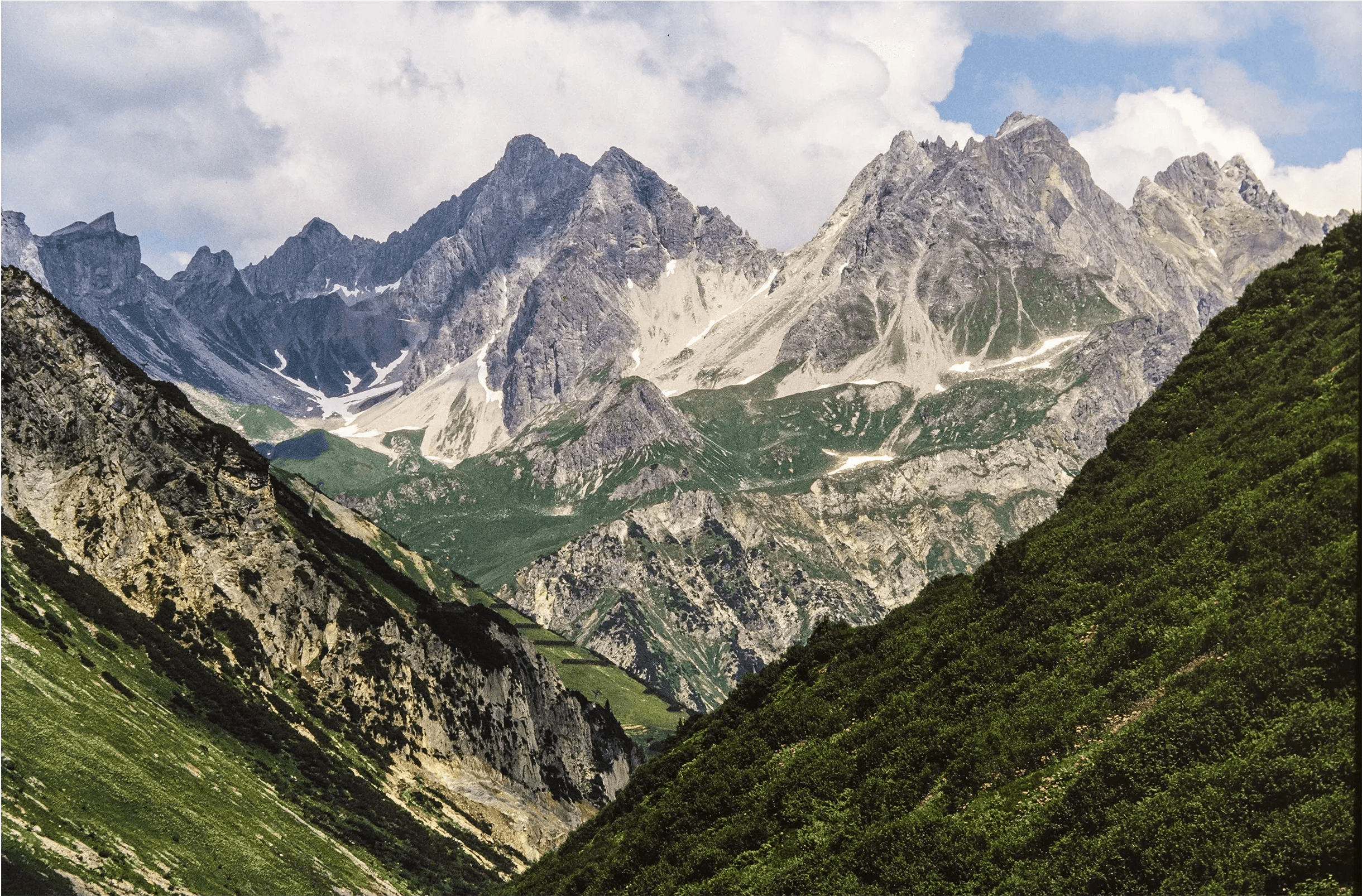
A little about the original Kodachrome 64
Kodak introduced Kodachrome 64 in 1974. It became known for its fine grain, sharp detail and distinctive colour, with outdoor, travel and nature photography among its strengths. Kodak discontinued it in 2009, but its look still gives photographers plenty to draw from.
What interests me is how those colours work together. There’s richness, but also a sense of balance. That’s what I wanted to explore with this preset.
What does it do?
A lot of the work is in the individual colours. Overall saturation is pulled back slightly, while blues are made deeper and more saturated. This gives skies and water more weight without needing to push every other colour along with them.
Greens are darkened and softened a little. Yellows are brought down in brightness, and reds are slightly reduced in saturation and nudged towards shades of orange. These are incremental changes, but together they help shape the palette.
The tonal adjustments soften brighter areas and open up darker ones. Highlights and whites are pulled back, while shadows and blacks are lifted. This gives you a gentler starting point that you can adjust to suit the light in each photo.
You can see examples in the Kodachrome 64 Gallery.
What to use it on?
Start with a few photos you know well. A street scene will show you how the preset handles buildings and sky, while a landscape or portrait will bring foliage and skin tones into the mix. Looking across those photos gives you a better sense of what works than judging it from one image.
Pay attention to the blues as you go. Because the preset deepens them, a sky that’s already quite blue may need less saturation. Foliage in deep shade is worth checking too, since it may need some adjustment of its own.
Making it work with your photos
Once you’ve applied the preset, get the exposure where you want it. The colour is easier to judge when the overall brightness feels right.
Then check the white balance. A photo taken in cool shade will respond differently from one taken in late afternoon sun, and even a small change in temperature or tint can make a difference to skin tones.
From there, let the photo guide you. If the greens feel too dark, lift their luminance. If the image feels too soft, add a little contrast. You can change any setting that doesn’t quite work for the photo.
Will it look exactly like Kodachrome?
It’s my interpretation of the film. Your camera, the light and your original exposure will all affect the final result, so the same preset will look different across photos.
Grab a roll for free over on my Gumroad.