
From
Alex Ruskman
Film emulation resources
There are certain film stocks that somehow become even more interesting once you can no longer buy them. Fujifilm Pro 400H is probably one of the best examples.
Years after its discontinuation, photographers are still chasing those cooler greens, delicate skin tones and slightly airy colour it became so closely associated with. Presets, old rolls kept in freezers, endless attempts at recreating it digitally, the look never really went anywhere.

Fujifilm Pro 400H |Misus1504 via Flickr [2020]
A little about Fujifilm Pro 400H.
Pro 400H was an ISO 400 daylight-balanced professional colour negative film, first introduced as Fujifilm NPH 400 in 2002 before being renamed and repackaged as Pro 400H in 2004.
It was built largely with portrait, wedding, fashion and commercial photographers in mind, with particular attention paid to fine grain, natural skin tones and maintaining colour accuracy under less than perfect lighting.
And, for a long time, it was probably the most obvious Fuji alternative to Kodak Portra.

Fujifilm Pro 400H | Manydoors via Flickr [2021]
The difference was easy enough to spot. Where Kodak films so often invite yellows, reds and warmth into the frame, Pro 400H could feel noticeably cooler. Greens had their own character, skin remained soft without becoming lifeless, and the whole palette felt a little cleaner.
It’s a look that became inseparable from an entire generation of wedding photography.
That famous fourth colour layer.
One of the more interesting things about Pro 400H was hidden inside the emulsion itself.
Alongside the conventional red, green and blue sensitive layers, Fujifilm used its fourth colour layer technology to improve colour reproduction under difficult lighting, particularly fluorescent and mixed light situations.
Quite a lot of engineering for a film that is now so often reduced to the word “pastel.”
The colours could still be plenty rich. Blues remained clean, foliage had life, and skin could hold warmth without every other colour in the frame following it.

Fujifilm Pro 400H | misus1504 via Flickr [2020]
Those greens.
This is probably the part of Pro 400H that stays with me most.
There was something very Fuji about the greens. They could lean cooler without turning completely lifeless, particularly when the negative had plenty of light. Put a face beside that greenery and you had this lovely separation between the warmer skin and the cooler environment surrounding it.
You see it constantly in older wedding photographs shot on 400H: pale dresses, open shade, huge patches of foliage and skin sitting quietly somewhere in the middle.
Calling it simply “light and airy” doesn’t really do it justice.

Fujifilm Pro 400H | Jill Slater via Flickr [2021]
Exposure became part of the look.
The funny thing is, a lot of photographers weren’t actually shooting Pro 400H at ISO 400.
Rating it at 200 was extremely common, and plenty of photographers went further again. Give the negative more light and the colours begin opening up, shadows clean out and those softer skin tones become even more apparent.
Some of what we now think of as the Pro 400H look came from that habit.
A generously exposed negative, a bright scan and a good lab could push the film even further into that soft, open palette people now try so hard to recreate.
Then there’s the scanner.
This is where things start getting even more interesting.
A Frontier scan of Pro 400H and a Noritsu scan of the exact same negative do not necessarily look the same. Density, colour balance and lab preference all play their part, especially with a stock that became so heavily associated with a very particular style of professional photography.
So when somebody says they are chasing “Fuji 400H colours,” there is always another question hiding underneath it.
Which 400H colours?
Was it rated at 400 or 200? Shot in open shade or direct sun? Frontier or Noritsu? Was the lab asked for brighter scans? Cooler scans?
The negative gave you the foundation. The final look was never entirely down to the film itself.
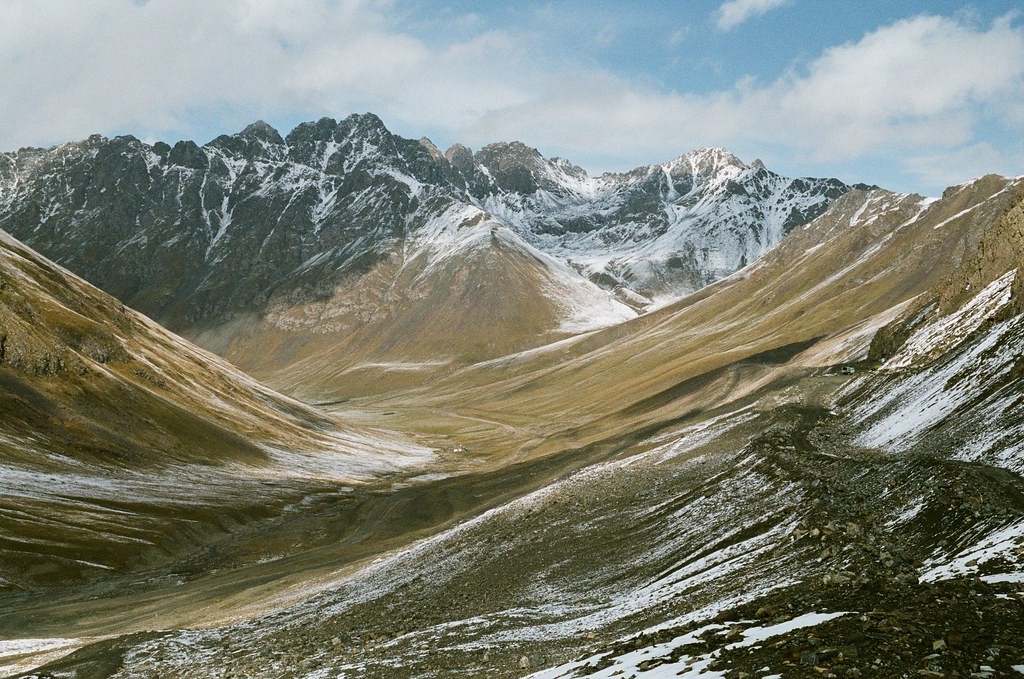
Fujifilm Pro 400H | misus1504 via Flickr [2020]
And then it disappeared.
Fujifilm announced the discontinuation of Pro 400H in January 2021.
Its fourth colour layer required specialised raw materials and chemicals that had become increasingly difficult for Fujifilm to procure. Production wound down and suddenly photographers who had spent years building their work around the stock had to look elsewhere.
I can imagine quite a few freezers being cleared out around that time.
Portra 400 became the obvious replacement for many, but it was never going to look exactly the same. Once the supply started disappearing, the character of 400H only seemed to become more desirable.
Bringing Pro 400H into Lightroom.
When I worked on my own Pro 400H emulation, I kept real film scans beside the Lightroom window and paid very close attention to the relationship between the colours.
Simply pulling saturation down and pushing green towards cyan gets ugly pretty quickly.
Skin still needs some warmth. Greens can cool off without becoming radioactive. Highlights need to remain soft, while the midtones still need enough contrast to stop the whole photograph looking flat.
Exposure matters here as well. So many of the references people associate with 400H were bright scans made from generously exposed negatives. Match the colours but leave the digital file dark and heavily contrasted and something immediately feels off.
I found it much more useful to look at a range of real scans rather than one perfect example. Different light, different photographers, different exposures.
The inconsistencies actually help.
My free Lightroom homage: Fujifilm Pro 400H

Fujifilm Pro 400H | Jill Slater via Flickr [2022]
So why do photographers still chase it?
I don’t think people miss Pro 400H purely because it disappeared.
It occupied a genuinely interesting space. Beautiful skin tones, cooler greens, fine grain and enough speed to make it practical for the people actually using it professionally.
And then Fujifilm took it away.
Now every remaining roll has an expiry date attached to it, and every digital attempt at recreating its look begins with photographs made when buying another box was completely ordinary. Perhaps that alone has added to the mythology.
But I think the simpler answer is that Pro 400H just looked bloody good.
Thanks for reading,
Alex